FRESH off the desktop…francdesign creates a new logo for the Park South Hotel brand in NYC
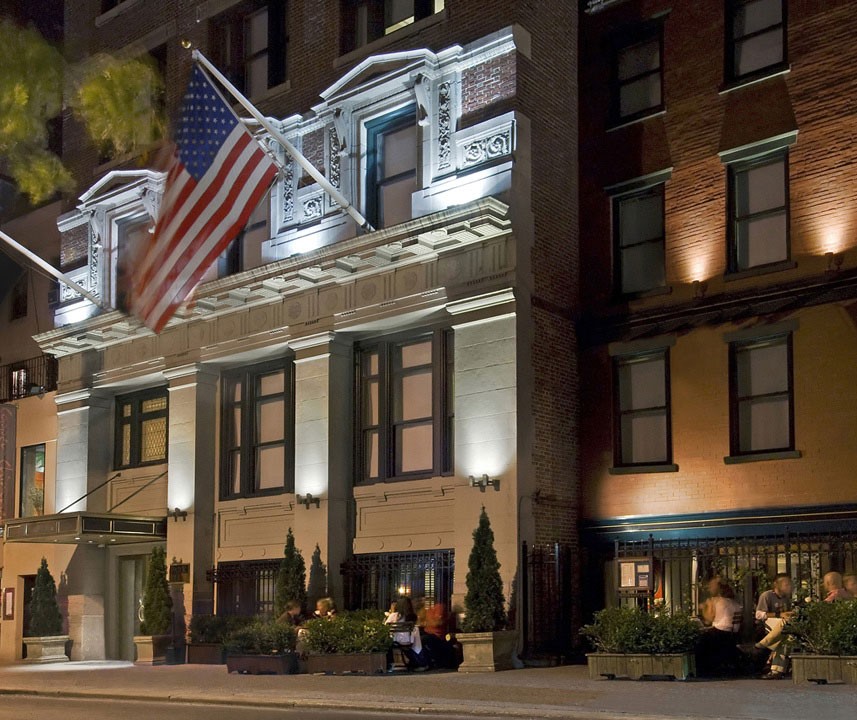
Keeping pace with the renewed vitality that is making Park Avenue South and the Flatiron District Manhattan’s hottest new destination, The Park South Hotel, at 124 E. 28th St., recently refashioned itself to delight 21st century business and leisure travelers.
READ MORE about our creative process
francdesign’s Approach
To complement the hotel’s newly refashioned ambiance and keep pace with the evolving neighborhood, the hotel’s branding needed to adapt. Our task was to design a new logo that was contemporary and fresh, reflecting the vibrant NoMad (north of Madison Ave.) area that surrounds it.
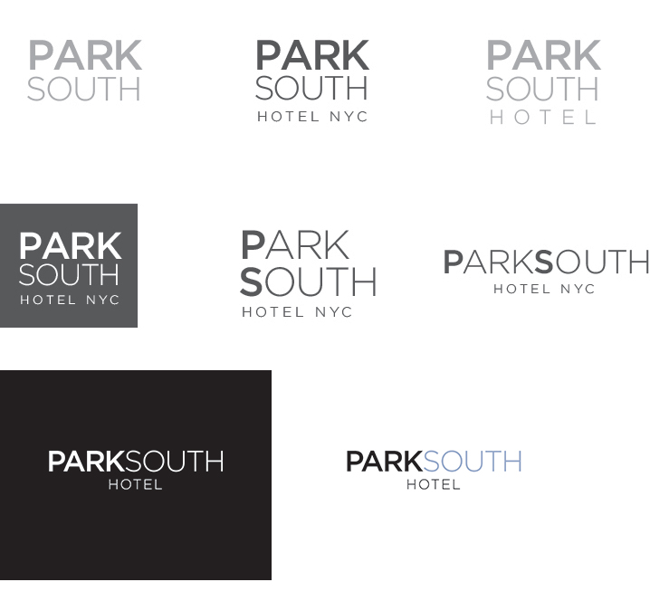
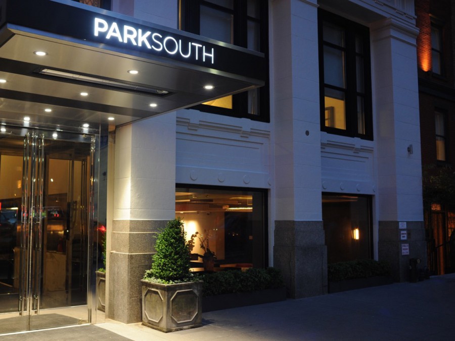
The challenge was to develop a brand that was structured, flexible, and would “have legs.” The name Park South would remain the same. We selected a clean font that functions equally well in digital, print, and environmental signage applications.
Brand Exploration
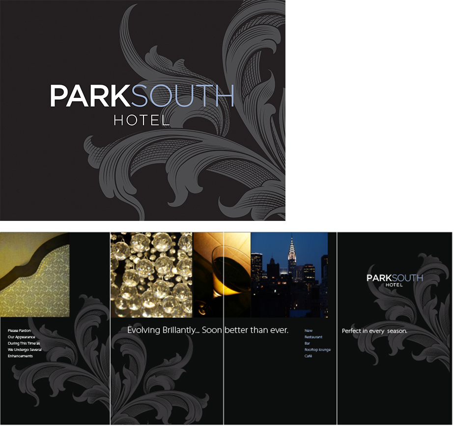
To position the hotel as modern classic, we chose a friendly, approachable palette that conveys a sense of stylish openness. Finally, we incorporated an Art Deco graphic flourish to compliment the hotel’s architecture and enhance the overall brand feeling.
Park South visual identity demonstrated in full color with wall graphics creative
The resulting logo is strong, timeless, and contemporary. It functions well on all platforms and – best of all —our client is very satisfied with this fresh brand identity.
You can see more of our refreshed creative for the Park South Hotel here. If your brand could use a revitalizing makeover, contact francdesign today!

No Comments